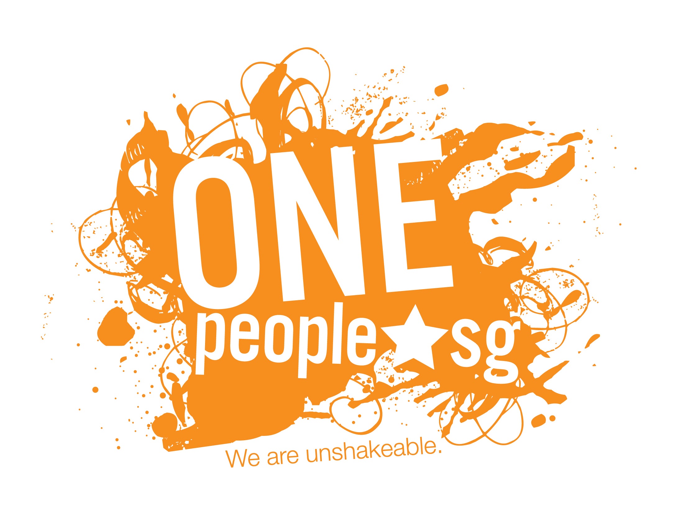
Our Logo

The logo is a unique brand identity designed to stand out by capturing the bold spirit and the zest of a united and strong Singapore.
A star represents the “dot” in www.onepeople.sg, incorporating Singapore’s national flag identity. The merging of the five stars on Singapore’s flag into one also represent the five self-help groups, the five community development councils and People’s Association working together with OnePeople.sg and continuing to create a strong sense of belonging.
The fluid yet edgy graphic element symbolises the organisation as the pulse of the community, one that evokes healthy vibes and energy that is full of vigour, engaging Singaporeans through the rhythm of their initiatives.
Juxtaposed on the dynamic graphic element, the clean font reflects the confidence and competence of the organisation in performing its role, projecting a brand image that is perfectly balanced in fun and integrity.
The logo has the versatility to take on different vibrant colours which continually projects a creative and progressive outlook. This reinforces the active role of the organisation in promoting multiracialism and multiculturalism.
Overall, the combined design elements establish a strong brand image of a modern, youthful, vibrant and dynamic organisation.
